Case study
Ride Loud
Designing the discovery map for an outdoor adventure app already used by thousands of riders.


An app that already existed
Ride Loud connects people for dirt biking, mountain biking, skiing, surfing, hiking and other outdoor sports. You create an adventure, others tag along, and the group plans it together. By the time I joined, on version five, another designer had already shipped the app people were using.
The client had a list of about thirty features they wanted to add. Unlike a from scratch build, every one of them had to work inside a product with existing users, existing habits and an existing visual language. Nothing could feel bolted on.
The client stayed closely involved. We spoke twice a week, and each feature went to them for approval as soon as it was designed, rather than as one large handover at the end.
Solving it without labels
There were two ways to make the map readable.
Label every pin
Clear in theory. On a crowded map it trades one problem for another: now it's full of text instead of full of dots, slower to read, not faster.
Custom icons, no labels
A distinct icon for each sport category, readable at a glance with no text at all. A dirt bike pin looks nothing like a ski pin from across the screen.
Direction taken
I designed fifteen to twenty custom icons, one per sport. The rule I held to throughout: the map has to stay glanceable, so the icon has to carry the meaning on its own.
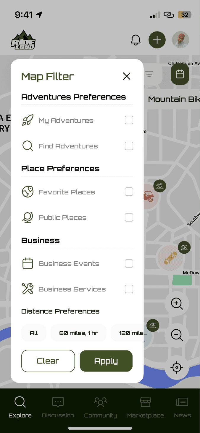
Filter and sort pills sit above the map, so someone can narrow to their own sport, or leave everything on and let the icons do the work.
Fifteen to twenty custom icons, built so the sport reads before the label would.
A map that shows everything is a map that shows nothing.
The problem the discovery map had to solve
What happens when you tap a pin
A pin isn't the end of the interaction, it's the start of a decision.
A card, not a new screen
Tapping a pin opens a card over the map rather than a full screen, so browsing never really stops.
What actually decides yes
Location, date and time, trail difficulty, who's already going, and the weather. The details that decide whether someone says yes to an unfamiliar trail.
Two actions, not one
Tag along, for someone ready to commit. Chat with the group, for someone who wants to ask a question first. Without the second, anyone hesitant just closes the card and never comes back.

Two actions for two states of mind: ready to go, or one question away from it.
Working inside someone else's system
None of this happened as a solo decision. Every feature in V5, including the map, went back to the client twice a week for review.
I designed in short loops rather than long ones, which meant defending a direction quickly and adjusting fast when something didn't land.
That's a different skill from designing a product from nothing. The system, the visual language and the user base already existed. My job was to extend them without anyone noticing the seam.
What I'd change
Add a legend to the icon system
The custom icons work well once you know them, but a first time user opening the map cold has no way to learn what each one means.
A small expandable key, tap once to see every icon with its sport, would make the system work for newcomers as well as regulars.
Give the found item flow the same weight as adventures
Ride Loud takes safety seriously: emergency contacts, sharing adventure details, safety notifications. Losing gear on a trail is a real, stressful moment too.
It deserves a flow built with the same care, not treated as a minor utility next to the rest of the app.
How this project ran
This was a two month engagement at Zazz, working on an existing app I hadn't designed the earlier versions of. I was the sole designer on V5, with a design manager and PO overseeing the work, a PM coordinating development, and separate iOS and Android developers.
The client was directly involved throughout, with twice weekly calls and feature by feature approval rather than one handover at the end.
Next project
Designed by Dileep Kumar M