Case study
Turning an offline advisory practice into a two-sided booking marketplace, without making paid advice feel transactional.
The starting point
The client already had advisors. They were giving career advice offline and through enquiries on their website, informally and mostly unpaid.
They wanted an app that did two things: connect those advisors to people seeking advice, and let the advisors earn from it.
So the product wasn't creating a new behaviour. It was moving an existing one into an app and adding money to it. That's a smaller-sounding brief than it is. Trust that had been built face to face now had to survive a profile screen. Scheduling that happened over email became an availability system. And an advisor who used to help as a favour now had to decide what an hour of their time was worth and type that number into a form.


The one piece of client direction that shaped everything after it
The fork
There were two ways to read that.
A directory
Optimised for intent. Search, filter, sort, book, leave. Fast for someone who knows what they need. Cold for someone who doesn't, and it puts every advisor on a shelf next to every other advisor, priced by the hour.
Something warmer
Optimised for discovery. You arrive, you see people rather than listings, you browse before you commit. Better for trust. Slower for someone in a hurry.
Direction taken
I kept the directory's structure and changed how it feels to move through it. The listing is still a listing. But it's ranked on trust signals rather than alphabetically or by price, and it's pre-filtered against what the user told us about themselves at signup, so it reads as people who can help you rather than a catalogue of consultants.
The cost of that choice is real. Personalised ranking is worse for the user with a specific, unusual need, because the thing they want may be filtered out of view.


Advisors ranked on rating and review quality, filtered against career interests captured during signup.
Designing discovery
Three mechanisms, each for a different user.
Trust-ranked listing
Advisors surface in order of rating and review quality. For a first-time user with no strong opinion, the highest-signal option is the first thing they see. This is the default path and most users never leave it.
Interest-based pre-filtering
Career interests are captured during profile setup, not asked again later. The listing filters against them from first launch, so the app is personalised before the user has done anything to personalise it.
Search on home
Not behind a tab, not on a separate screen. The user who arrives knowing they want a marketing advisor this week types it and goes. This is what protects the hurried user from the browse-first model.


Search sits on the home screen so intent-driven users skip discovery entirely.
Closing the trust loop
The ranking only works if reviews actually get written. Post-session prompts are dismissed constantly, so a single capture point would have starved the system that the whole discovery model depends on.
Two capture points instead. Immediately after the session ends, chat or call, a prompt to rate the advisor while the experience is still fresh. Later, from the calendar, any completed session that hasn't been rated still carries the action, so the user who dismissed the first prompt can come back to it from a place they already visit to manage bookings.
The second one exists because dismissing a prompt isn't the same as declining to review.


Two entry points for the same action, because a dismissed prompt isn't a declined one.
The other side
A marketplace needs both sides designed, and the advisor side carried more weight here. They were the scarce supply and the reason the product existed.
Advisor setup covers personal details and career history in two steps, including a career timeline that becomes the credibility surface on their public profile. Beyond onboarding: availability management, session and booking views, transaction history, and payouts.
Two products in one app, sharing a component library and a visual system, with entirely different jobs to do.

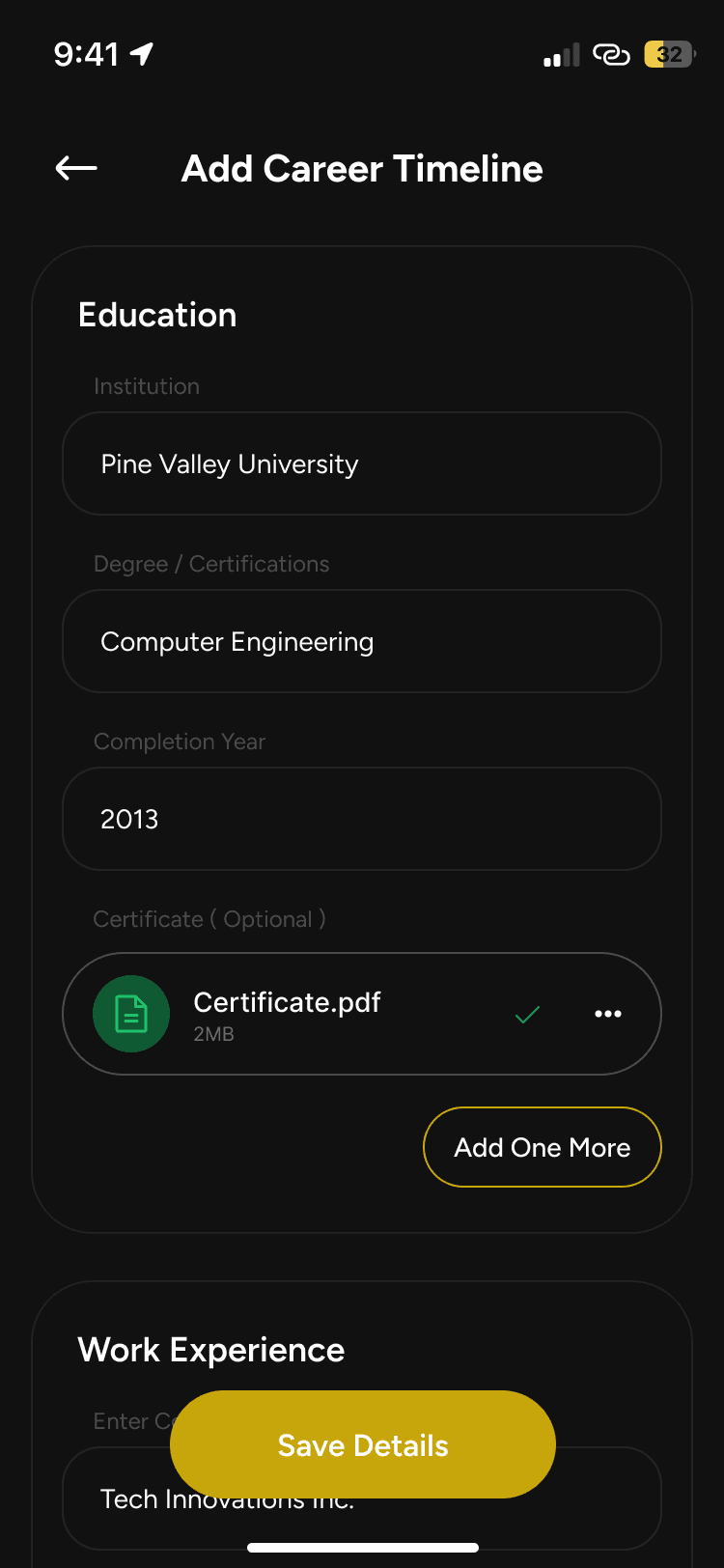


The advisor side: onboarding, credibility, availability, and earnings.
What I'd change
Availability isn't visible until you open a profile
Booking is the point of the product, and a user can't tell from the listing whether an advisor is free this week. On a rating-sorted list, that means opening profiles one after another until someone has an open slot.
The fix is a next-available signal on the card and availability as a filter. It wasn't in the requirements, and I didn't push for it. I would now.
New advisors can't get started
Ranking on ratings means an advisor who joins today has no ratings, so they rank last, so they get no sessions, so they never get rated. The loop never opens for them. And since the client's whole reason for building this was to get their advisors earning, the mechanic that makes the product trustworthy is the same one that could choke its supply.
Three ways I'd approach it: reserve positions in the ranking for new advisors, add a recently-joined surface with its own entry point, or seed initial reviews from the offline relationships these advisors already had. The third is cheapest and fits how this client's advisors actually came to the platform.
How this project ran
This was agency work. Requirements were fixed in a BRD agreed with the client before design started, and scope didn't move after that. My latitude was in interpretation and execution rather than in defining what got built.
The build was handed to the client's own team, so I don't have post-launch data. I'm not going to attach numbers to this that I can't stand behind.
Next project
Designed by Dileep Kumar M